#NTUMastered Spotlight: Kenton Mills
Our latest Spotlight piece features MA Graphic Design Theory and Practice student Kenton Mills
In the run-up to Mastered, we will be sharing a series of student projects from across the participating courses through #NTUMastered Spotlights.
Pascal
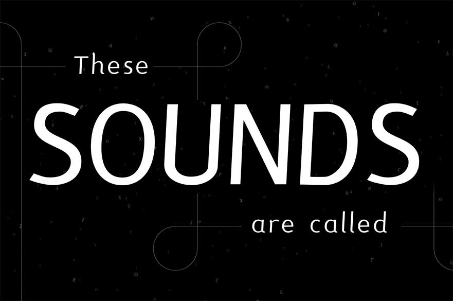
From the beginning of my MA I knew I wanted to do something with type. My research into reading education, and the range of assistive technologies and methods used to help young people who find learning to read and write tricky, lead me to focus on phonics. Phonemes are the individual sounds we use to build words - like syllables, only ground a little finer. When they are printed or written they are called graphemes. While learning to read and write with phonics is not vital, by the age of 11 most young people, phonics educated or not, have got the hang of it. However an education in phonics has been found to be of great long term benefit to young people, who for a variety of reasons, not just due to dyslexia, may struggle with learning to read and write.
From this research and enquiry, my font Pascal emerged. The typeface itself was designed to be as legible and easy to read as possible, and the letters of the font are coloured to make distinguishing individual graphemes easier for the reader. I initially tried to distinguish each specific grapheme, but there are hundreds, so this did not work. Graphemes can be between one and four letter long - I’ve not found any fives yet, and knowing when two or more letters together make a sound on their own is the tricky part of reading. So I used colour to remind the reader when those letters need to be combined. Black and magenta letters are individual vowels and consonants, cyan letters are read in pairs - these graphemes are called digraphs. Trigraphs and quadgraphs, groups of three and four letters, are orange.
I named my font Pascal, after Blaise Pascal who, in 1655, created the idea of synthetic phonics, a system of codifying letters and sounds. Pascal is also an SVG, or colour font. These sorts of fonts are not quite as widespread as regular ones, although more and more platforms are integrating them. Of course you can use them in most of your Adobe software, and major web browsers are gradually integrating them too. I made Pascal using the Fontself plugin for Adobe Illustrator, where you can play with a range of colour fonts. Give it a go, try it with your young people and feel free to let me know how it works out.
I’m sort of addicted to making fonts now. I’m not going to give up my day job - I’m a full time teacher - but this is not going to be my last font.
Kenton Mills, MA Graphic Design Theory and Practice
- Subject area: Art and design
- Category: Current students; School of Art & Design
Related news
-
NEWS
3D printed model hearts and lungs to help train transplant surgeons
21 March 2024Diseased model hearts and lungs - which can breathe and bleed like the real organs - have been created by experts at NTU.
ntu.ac.uk/about-us/news/news-articles/2024/03/3d-printed-model-hearts-and-lungs-to-help-train-transplant-surgeons
-
Funding for an innovative new research project that will help universities integrate Artificial Intelligence (AI) into their art and design education programmes has recently been secured by the Nottingham School of Art & Design, in partnership with Chelsea College of Arts (University of the Arts London), Liberty Fabrics, and Norwich University of the Arts.
ntu.ac.uk/about-us/news/news-articles/2024/03/funding-secured-to-develop-ai-toolkit-for-universities-teaching-art-and-design
-
NEWS
Nurturing Future Fashion Marketers: A Transformative Trip to Liverpool
18 March 2024In an enriching educational escapade, our MA Fashion Marketing students recently embarked on a remarkable trip to Liverpool, a city renowned for its vibrant culture and fashion-forward thinking. This journey was not only a testament to our commitment to practical, hands-on learning but also a showcase of the potential our students hold in shaping the future of fashion marketing.
ntu.ac.uk/about-us/news/news-articles/2024/03/nurturing-future-fashion-marketers-a-transformative-trip-to-liverpool